Big data is being touted as the great new source of actionable information for HR pros. However, while big data analysis can produce some fascinating results, beware—big data can be accompanied by big dangers.
 |
1. Presentation of Data Is Misleading
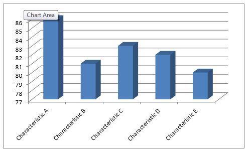
Sometimes it’s the choice for presenting data that is the problem. Here is a chart showing some characteristics, it could be performance rankings, or scores on a test, or pay for five middle managers. It appears from this chart that Characteristic A is much higher than Characteristic B.

However, that’s mostly a function of how the chart is drawn. It has a misleading base line of 77. Here’s the same chart, same data, but with a baseline of zero.

Now you can see that the differences are not so great. Depending on your situation, this small difference may or may not matter. In either event, this chart is presenting a more meaningful picture of the data.
It’s the brave new world of HR. Start your strategic thinking with BLR’s new practical guide: HR Playbook: HR’s Game Plan for the Future.
2. Averaging and Assumptions
Look at the annual sales for two groups of salespeople. Each group has four members.
Group A average sales is $400,000
Group B average sales is $400,000
It appears that the groups’ sales are similar. Since your basic expectation for salespeople is $330,000, you might conclude that both groups are doing well. But look at the individual sales figures:
Group A
- $50,000
- $42,000
- $658,000
- $850,000
Group B
- $300,000
- $400,000
- $400,000
- $500,000
Looking at the averages led you astray. In reality, one group has four average salespeople and the other group has two superstars and two hangers-on being carried by the other two.
Another commonly-used demonstration concerning averages and conclusions is the calculation of life expectancy. Most people “know” that life expectancy has dramatically improved through the ages. Where in former times, life expectancy was 30 years, now it is more like 80 years. Should we feel good about this? Should we assume that in former times most people died at age 30? What’s wrong with this analysis? Simply, the most important factor in life expectancy is infant mortality.
In the ages before vaccinations and modern health care, many babies and children died, and, of course, they are part of the average.
So the more meaningful figure is life expectancy at a given age, not the average of all ages.
3. It’s ‘Significant’ but Is It Meaningful?
Statisticians are very concerned with “significance,” which to them is a mathematical calculation that indicates whether the difference between two variables is likely to have occurred by chance. For example, “there’s only a 5% chance that this difference is due to chance.”
However, statistical significance doesn’t guarantee that the difference is meaningful in any practical way.
Let’s say the difference between the results of two ad campaigns is statistically significant. However, the difference in actual sales resulting from the difference may be only a few dollars over the course of a month. The difference is “significant” but not meaningful. Other factors, such as the cost of the ad and the ease of creation and placement, should probably carry the decision about which approach to take.
The same principle applies whether the difference is between two choices of action, or two groups of people.
HR 2015? Time to start planning with BLR’s new HR Playbook. Find out more or order here—HR Playbook: HR’s Game Plan for the Future.
4. Poor Sampling
Now suppose you are calculating the amount of time it takes to manufacture one widget. You measure the number of widgets produced during a day and do the math to come up with a production time for one unit. But that day might have been a particularly bad day (lots of downtime, bad batch of raw material) or it could have been a particularly good day, which would give an overly optimistic timing.
Or maybe you do your quality checking by looking at representative samples from the first batch produced each day. That may not be representative if something happens during the day (humidity changes, new supplier of raw materials, new person coming on shift).
A third kind of sampling problem is self-selection. You do a survey of employee engagement and get a high engagement score. But let’s say that only half the employees participated in the survey. It’s likely that the more engaged employees were the ones who took the trouble to do the survey, which significantly skewed the data to the high side.
5. Causation (Robins and the Spring)
The most common mistake in statistics is confusing correlation with causation—that is, making the assumption that because two things are correlated, one causes the other. A good demonstration of this is the hypothesis that robins cause spring. True, the two are highly correlated; spring does come when robins come. It’s obvious to all that that conclusion is ridiculous. But when the situation is not so obvious, it’s easy to fall into the correlation/causation trap.
Let’s say big data reveal that certain characteristics are found in most great salespeople, but not in others who are not so great. (Maybe many are tall, or smoke, or are overweight, or graduated from Midwest colleges.) It might appear reasonable to conclude that those characteristics were desirable and you should look for salespeople who have those characteristics. But there are likely myriad other characteristics or aspects of the environment that make the tops sales people so good.
In tomorrow’s Advisor, four more dangers of big data, plus an introduction to the new guide, HR Playbook: HR’s Game Plan for the Future.

For those who are scared of using data to drive home their presentation this piece is data presentation and analysis made easy. I commend the contributor, Stephen Bruce for this timely piece.