When reading reports, it’s easy to get lost in huge amounts of data and information. Often, those reading the reports can lose sight of the forest for the trees. In other words, it can be difficult to see the big picture because of the need to focus on large amounts of detail.

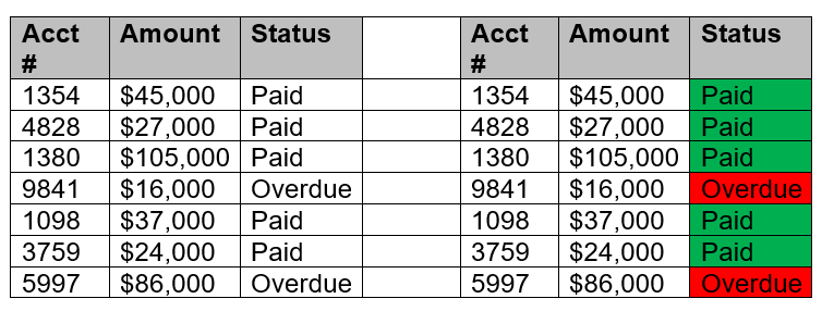
Consider, for example, the two reports below. Both contain the same information; however, the report on the left is presented in plain text, while the report on the right uses red and green color coding to distinguish between paid versus unpaid invoices.

The report using color coding offers an instant visual cue to issues in accounts receivable compared with the report without color coding. This is a simple report with only seven lines of data, but the benefit of color coding is clear.
Forms of Color Coding
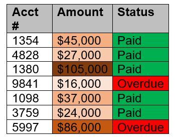
The example above uses a simple green-for-good, red-for-bad color-coding scheme, but there are many other options, as well. For example, a heat map can show more nuanced information using color to show degrees. Using the same information as above, we can assign a heat map to the dollar amounts of invoices to show the amounts in increasingly darker shades for increasingly high amounts.

This technique can also be used to group like items, such as color coding a list of all company employees so that operations employees are in orange, finance employees are in green, administrative employees are in blue, etc.
Color Psychology
For those looking to take their color coding to a new level, consider reading up on some of the basics of the psychology of color coding. This includes understanding how humans perceive different colors and the benefits of using consistent color coding in regular reports.
Color coding is a simple and easy way to add a new dimension to any data-heavy report. This makes it easier and more time-efficient for readers to identify key trends and outliers and easier for those presenting the report to get their key points across.
