What Is Regression Analysis?
Regression analysis is a statistical technique that predicts the level of one variable (the “dependent” variable) based on the level of another variable (the “independent” variable).
In a compensation setting, for example, that might be the relationship of executive pay to company size or company revenue.
David Wudyka, SPHR, MBA, BSIE, is the Managing Principal and founder of Westminster Associates in Wrentham, Massachusetts. His tips came during a recent webinar sponsored by BLR®.
Regression and Correlation
Regression analysis and correlation analysis often go hand in hand, Wudyka says. What’s the difference?
- Regression analysis: “Predicts” the dependent variable (d.v.) knowing the level of the independent variable (i.v.) (a “predictive” technique).
- Correlation analysis: “Explains” how the dependent variable changes (or “covaries”) when the independent variable changes (an “associative” technique).
Regression Analysis
The equation of a straight line is key to the concept of regression analysis:
Y = mX +b where:
X = the independent variable
Y = the dependent variable
m = the slope (in Excel the “parameter estimate”)
b = a constant (the “Y” intercept)
The Four Assumptions
There are important assumptions about the data for the equations underlying regression analysis to work properly:
- The relationship between X and Y is linear.
- Y is distributed normally for every X value (the bell-shaped curve).
- The variance of Y at every value of X is the same (“homogeneity of variances”).
- The observations are independent of one another.
How do we know that these things are true? You can be reasonably assured that your data set is appropriate for the use of regression analysis if you plot your data, view it, and it looks “normally distributed.”
What’s your compensation scorecard say? No scorecard? Join us on Monday, May 12, 2014, for an interactive webinar—Winning Compensation Scorecards: What and How to Measure for Effective Results. Learn More
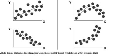
We like it when data points are tight about the line, says Wudyka, as seen on the lower left in the graphic below.
On the right, we see curvilinear relationships. There is not a linear relationship in data, so regression analysis is not appropriate. However, you could cull out a portion of the data and run the regression analysis on a straight part of the line.

Regression Analysis
The “regression line” is also known as the “line of best fit.” The regression line moves “through the center” of the data set. It “minimizes the distances” between the points on the line and the data above and below the line.

In this example, the y-axis variable value can be determined for any x-axis value.
If we were doing this “manually,” we would:
- 1. “Draw” a vertical line from the x-axis value to the regression line.
- “Draw” a horizontal line from that point to the y-axis value. That is the predicted value of the dependent variable, says Wudyka. Software can calculate this for you (e.g., Excel, SAS, SPSS). SPSS is Wudyka’s personal favorite.
2
It’s common to follow regression analysis with correlation analysis, says Wudyka, since the two analyses (and underlying formulas) are so closely related. The regression analysis establishes the line of best fit. The correlation analysis shows the strength of the line.
Winning Compensation Scorecards: What and How to Measure for Effective Results. Join us for an interactive webinar on Monday, May 12. Earn 1.5 hours in HRCI Recertification Credit. Register Now
The Key Correlation Measures
“r” is the correlation coefficient. It measures the “strength” and direction of a line (+ or -). Think of this as the sharpness of the “slope.”
“r²” is the coefficient of determination. This is the most important measure, Wudyka says. It measures the strength of the relationship between two variables (how they “covary” or how much one “explains” the other).
What do lines look like at various values of r?

In the left top and bottom lines, r is -1 or 1. Very strong, says Wudyka.
In the middle examples—the correlations are -.6 (r2 will be .36—not a strong correlation) and .3 (r2 will be .09, a very low figure).
In the right hand examples, there is low correlation—when one value moves, the other doesn’t.
If your data is “tight” around the regression line, then the correlation value (r-squared) will be higher.
For example, if the dependent variable is “CEO Pay” and the independent variable is “Company Revenue” and r = .9, then r² = .81. And that means that Company Revenue “explains” 81% of the variation in CEO Pay.
What “explains” the other 19%? It could be, for example, performance, education, or experience. When you add one or more variables to the analysis, it becomes a “multiple regression” analysis. Have much less effect, for example, it will explain only another 5%.
What does the “r” value mean? It simply indicates the strength and direction of the regression line, Wudyka says. “Squaring” it gives us even more important information about the variables.
What is a “strong” r-squared value? For me, says Wudyka, it’s “.5 to 1.0,” but obviously, the stronger the better. Your standard may be higher, he says.
In tomorrow’s Advisor, a real world example of how to use regression analysis, plus an introduction to a timely webinar all about compensation scorecards.
